Books & Beers is a non-profit book club based in Boston, Massachusetts that pairs beer tastings with book discussions. It started with a group of friends that wanted to read some books together, and their monthly meetings developed their own natural format where each meeting, the members would bring a local brew to share with the group. They wanted a logo that reflected the group's modern, mature vibe that they could use on group merch.
Project Type: Logo Design
Role: Graphic Designer
Tools Used: Illustrator, InDesign
Year: 2024
Initial Logo Sketches
I was pretty excited about creating this logo and went a little overboard in the amount of logo sketches that I drew out and presented. I thought the club name was super cute! After showing the sketches to the client, his first impression picks were the sketches circled in blue. Then, we decided to move forward with concept #17.
These were the initial feedback notes discussed with the client. On to the refining!
First round of refining: Here I played around with different icons representing the book and hops, as well as different fonts to try to find the correct brand "feel". After staring at the logo for way too long, we decided to go back to using the letter B's in the logo mark, and using "Books & Beers" as a paired wordmark.
Final Logo
We decided to flip the position of the book/hops icons and the B's, and inverted the hops icon—although I initially designed the hops icon after the way that the plant actually grows, the client just thought it looked better facing up.
Logo Guidelines
Brand Typefaces


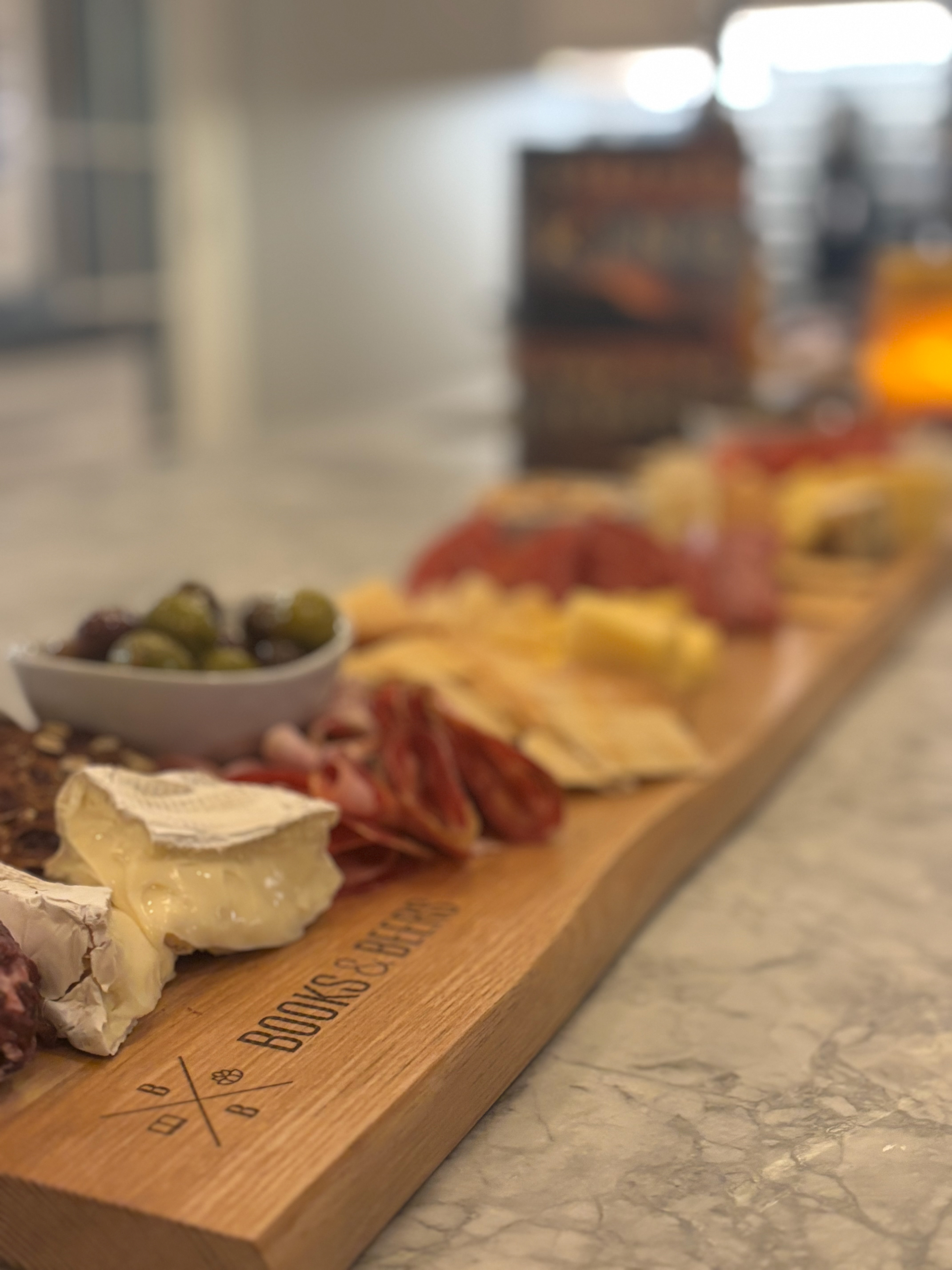
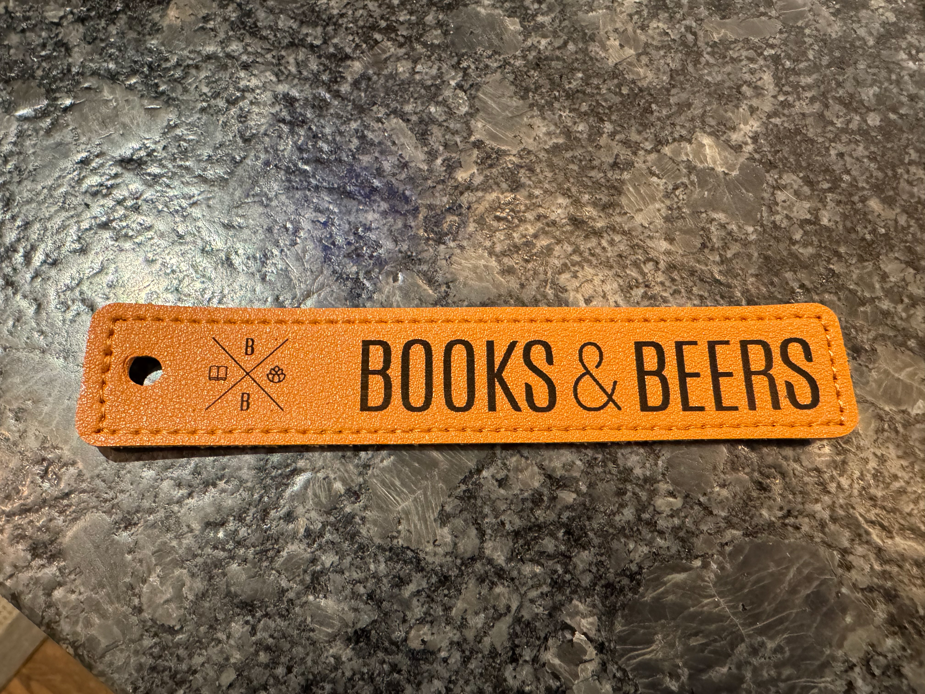
Printed merch created by the client. Left: charcuterie board; right: leather bookmark.
